Luotain
Link shortening with QR code analytics. Every code tracks its own scans, and stays editable after it’s printed.

Luotain
Short links and QR codes that remember every scan
Problem
You know those QR codes on restaurant tables. A place near me printed a few hundred of them for a new menu, then moved the menu to a different URL a month later, and every single card was dead. The code still scanned fine. It just went nowhere.
That stuck with me because it’s such an easy thing to fix and nobody does. Every shortener I looked at treats QR codes like an afterthought. You make a link, then there’s a button buried somewhere that hands you a PNG, and that PNG has no analytics and no way to change where it goes. So if you’ve stuck the same code on a flyer, a window and a receipt, you’ve got no idea which one people are actually scanning.
So that’s what I built. Every link gets a code, the code has its own scan data, and you can change the destination whenever you want. Print it once, point it wherever.
It’s called Luotain, a Finnish noun meaning “probe” or “detector”. I know, I know, really cool name, thanks. And if I had a nickel for every one of my projects that starts with an L, I’d have two nickels. Which isn’t a lot, but it’s weird that it happened twice.
My role
All of it, on my own: the product, the design, the frontend and the backend, and the social accounts too. It’s built on KernUI’s tokens, with Next.js, Postgres through Prisma, an email-code sign-in I wrote myself, Resend for email, Polar for billing, and DNS verification for custom domains.
Solution
You can just use it
The homepage isn’t a screenshot of the app, it’s the app. Paste a link in, get a real short link back. Flip to the QR tab and you get a real code you can restyle and download. No signup, nothing.
The bit I’m actually pleased with is that the links follow you. If you make one on the homepage and then sign up in the same browser, it’s already sitting in your account when you land, clicks and everything. Getting that wrong would have been rough. You try the product, you like it, you sign up, and the thing you just made is gone.
Making a link and making a code are the same screen
There’s a toggle up top, Short link or QR code. It looks like it switches modes but it doesn’t. Both do exactly the same thing, the toggle just decides where you end up afterwards.
I had it the other way at first, where the fields changed depending on what you picked, and it felt like two different tools sharing a screen. Worse, the toggle turned into a question you had to answer before you knew the answer. You’d pick Short link, fill it in, remember you actually wanted a code for the flyer, flip it, and half of what you’d typed moved or vanished. Now the toggle only decides where you land afterwards, so you can change your mind at any point and lose nothing. Nothing moves.
Features
The designer
Colours, patterns, your logo in the middle. The corner squares get their own colour separately, which is the bit most people want, because you can brand those without touching the rest and breaking the scan.
Tap the code and it opens bigger and tilts toward your cursor. It lags behind the pointer slightly rather than following it exactly, and honestly that lag is the whole effect. When I had it tracking perfectly it felt twitchy and cheap.
Downloads are PNG or SVG, and the PNG comes out at 1024 with a white background. Transparency sounds like the nicer option right up until somebody drops the code onto a dark card, it inverts, and no phone can read it.
Which one worked
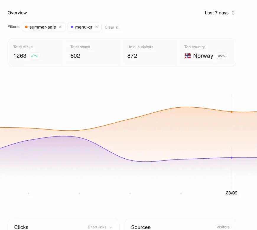
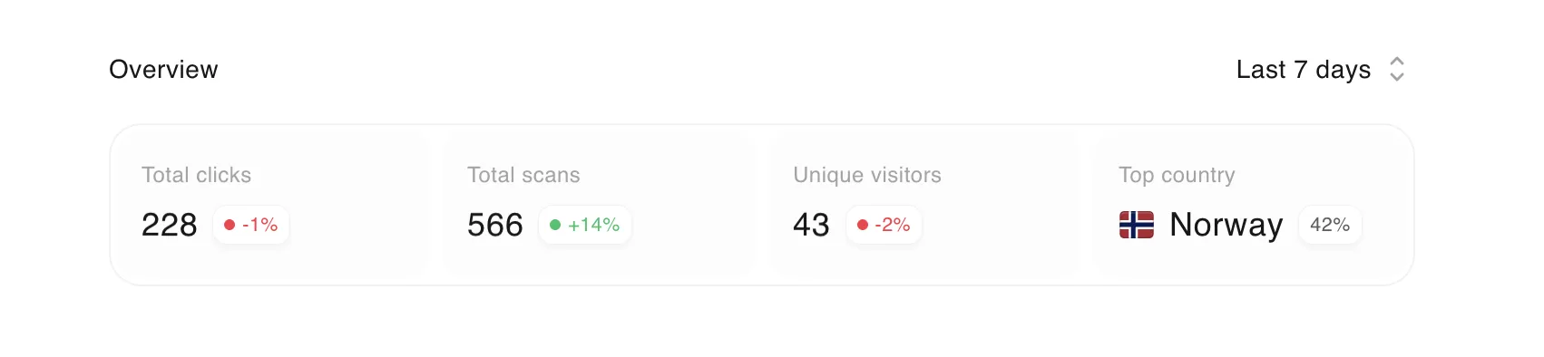
Four hundred clicks doesn’t tell you anything. What you want to know is which of your five placements got them. So nothing is summed, it’s all split by source, country and device.
Comparing links side by side
This one’s my favourite and it’s easy to miss. On the clicks chart you can tap two or three links and it splits them out instead of showing you the total.
The rows animate to their new positions when the order changes rather than jumping, which took longer than the comparison itself. When you toggle a filter and the ranking shifts, rows sliding to where they belong reads as the data updating. Rows teleporting reads as a bug.
Custom domains
This screen is boring and I’m weirdly proud of it. It has to teach DNS to someone who’s never touched DNS, and get it right, because the record you need depends on the shape of your domain. go.yourbrand.com takes one kind, yourbrand.link takes another, and DNS flat out won’t let you use the first kind at a root domain. So the page works out which you gave it and only shows you that one.
It checks in the background while you’re waiting and stops when you switch tabs. And when it fails it tells you what went wrong instead of just going red.
Lessons
Letting people use it beats explaining it. I tried to describe Luotain in a paragraph more times than I’d like to admit, and none of them did what ten seconds with the real thing does. That was also the most expensive decision to build. Making a link before you have an account meant building an anonymous workspace and a way to claim it, so the link comes with you when you sign up. Worth it, but it’s a lot of backend for one line in a design doc.
The boring screens carry as much of the product as the fun ones. The tilt is what people react to, but the DNS screen decides whether someone actually gets their domain working, and it’s the one I’d least want to get wrong.
Where it’s at
Luotain is live, and it’s early. There aren’t numbers worth putting on a page yet, and I’d rather say that than dress up a small launch. What I’m watching is the thing the product exists for: whether people who make a link on the homepage come back after signing up and change where it points. If they do, the printed-code problem is solved. If they don’t, it’s just another shortener.
If I started again, I’d build the split analytics first. They’re the reason Luotain exists, and they came last, after the create screen and the designer. Those are the parts people see first, but they’re not the parts that make anyone stay.
connect
I’m always up for talking to thoughtful people about design systems, interfaces, and the code they turn into. Reach me at shatermt@gmail.com, or find me on X and GitHub.